
What a Look is
Your schedule can be arranged in one of five ways. Same classes, same prices, same booking, in a different shape.
The setting is called the Look, and you will find it in the schedule editor. Whichever you pick applies everywhere that schedule appears: embedded on your own website, on a link you have shared, and on your reservie page. One choice, not one per place.
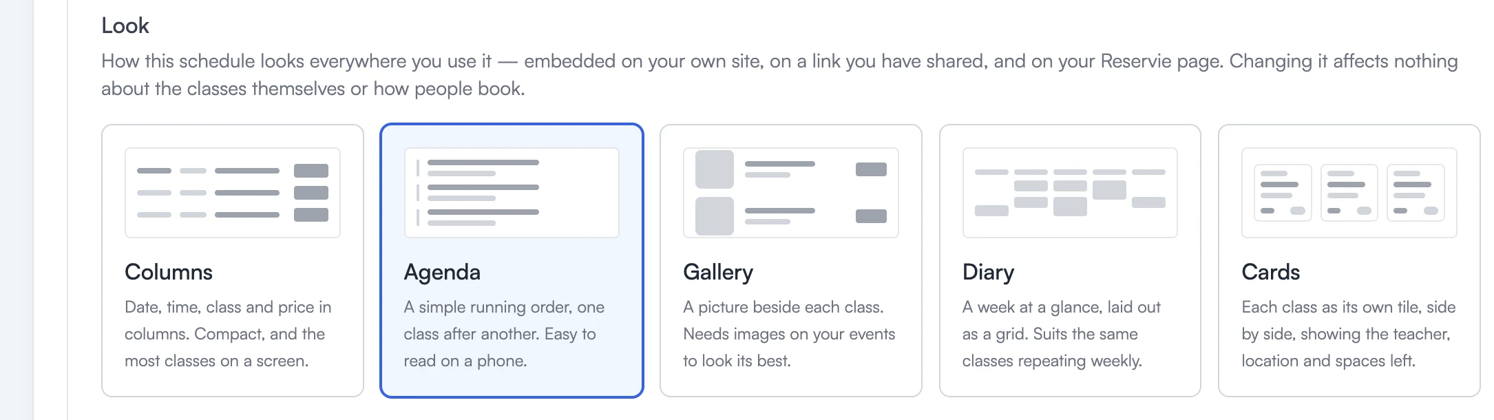
Pick a tile and save. That is the whole interaction: there is nothing to configure inside a Look, no colours to set and no per-class overrides.
Doing nothing is a perfectly good answer. Every schedule starts on Columns, which is what you have today. Nothing changes unless you decide it should.
The five
Columns
One row per class with the date down the left. Compact, and it fits the most classes on a screen.
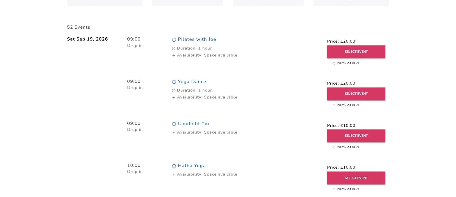
Agenda
One line per class, one after another, with a hairline between each and the day named above the group. The class name is the largest thing on the line and everything else sits a step quieter.
Suits a busy timetable where somebody already knows roughly when they want to come and is scanning for a time. It reads well on a phone.
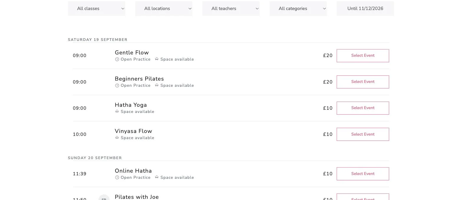
Gallery
A picture beside every class, with the class description shown in place rather than hidden behind a link, and a week strip along the top to pick a day.
This is the one that rewards having pictures on your classes. A class without one gets a tile showing its initials on a colour taken from its name, which looks deliberate rather than broken, but Gallery is at its best when the pictures are there.
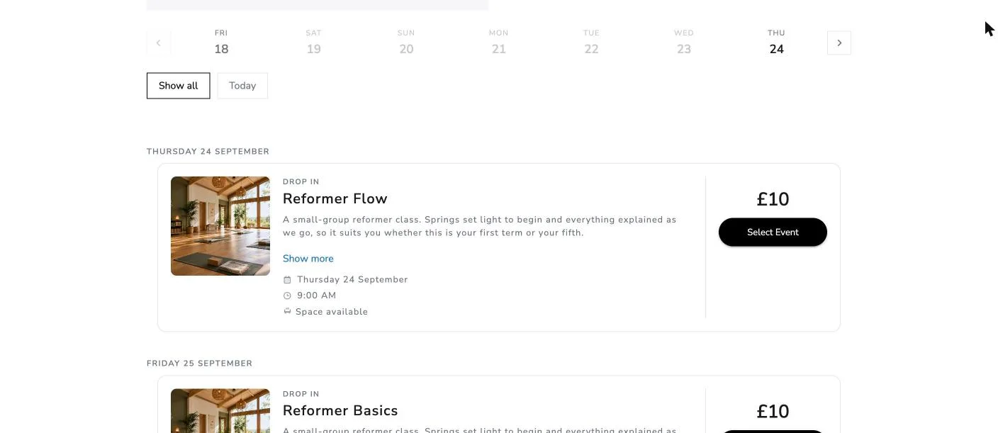
Diary
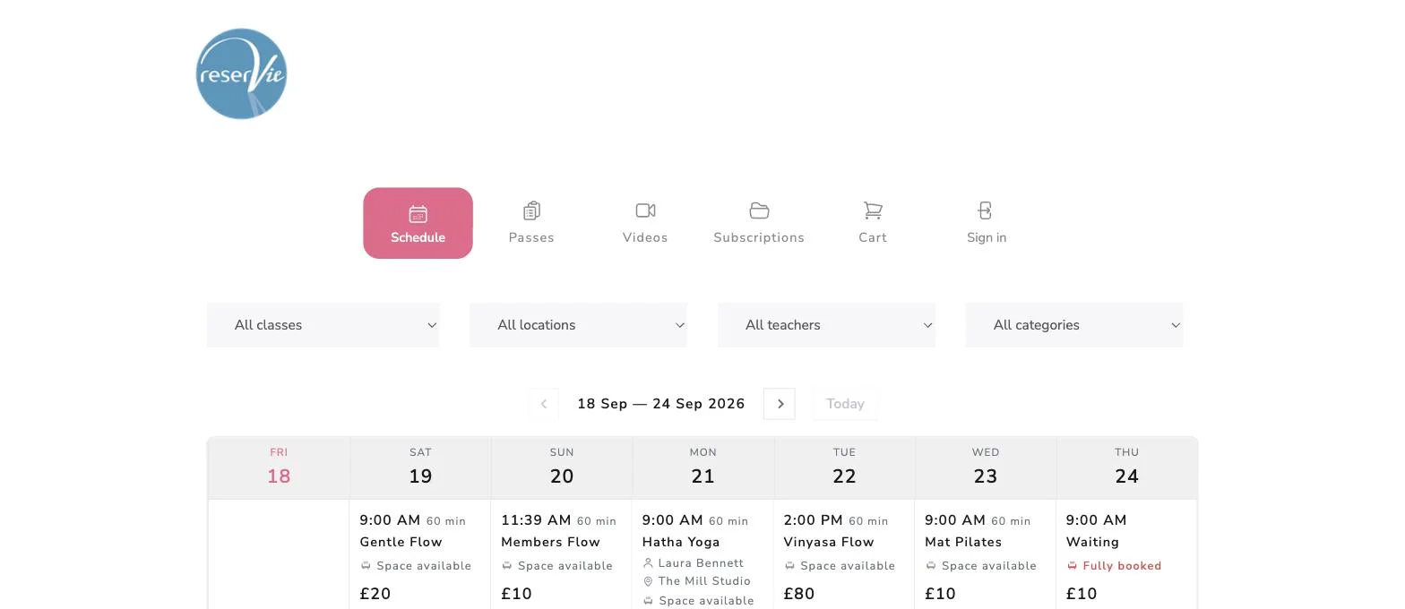
A seven-column week, one stack per day, classes in time order. Arrows move a week at a time and a Today control brings you back.
Suits customers who think in weeks — “what’s on Thursday?” — and studios with a repeating weekly rhythm. The booking button appears when you point at a class, which keeps the grid calm when a week is full.
Cards
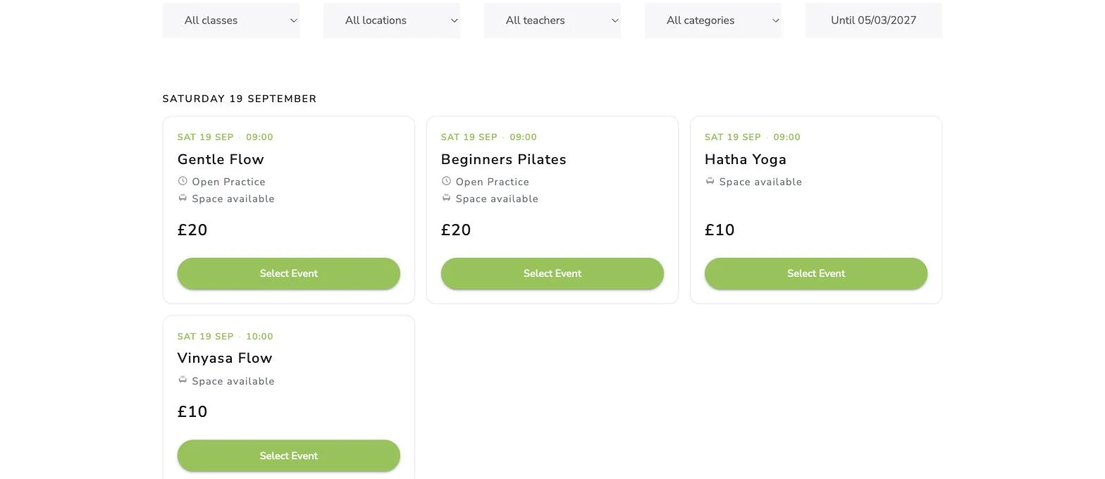
Each class as its own tile, side by side, showing the teacher, the location and how many spaces are left. Roomier than a list, and it carries more than a name and a button.
What a Look does not change
Worth being plain about, because changing how your schedule looks sounds riskier than it is.
Only the timetable. Passes, videos, subscriptions, gift vouchers, appointments, the basket and the checkout look the same whichever Look you pick.
Not how people book. Same controls, same quantities, same waiting lists, same passes and credits. Somebody who knows how to book still knows how to book.
Not your prices. The figure is presented differently in places — larger, or with “From” where a class has several ticket types — but it is the same price from the same place.
Not your colours or font. Your accent colour and font carry through whichever Look you choose. The examples above are different schedules, which is why the button colours differ between them.
Not any styling you have had built. If a developer has customised your widget, those customisations still apply and still take precedence.
Warnings stay red or amber whatever your accent colour, so “3 spaces left” still reads as a warning on a red-branded schedule.
Choosing one
Pick the shape that matches how your customers think. If they know roughly when they want to come, Agenda or Columns gets them to a time quickly. If they plan by the week, Diary. If your classes are worth looking at and you have photographs, Gallery.
If you are unsure, change it and look at the result on a phone as well as a desktop. Nothing about your classes or your bookings is affected, and you can change it back.
Next steps
- Getting Started with Schedules covers the rest of the schedule settings.
- Creating and Editing Events covers adding a picture to a class.